Year
2025
Client
Connect X
Category
Branding (Logo) · UI/UX · eCommerce · Conversion Optimization
Product Duration
1 Month
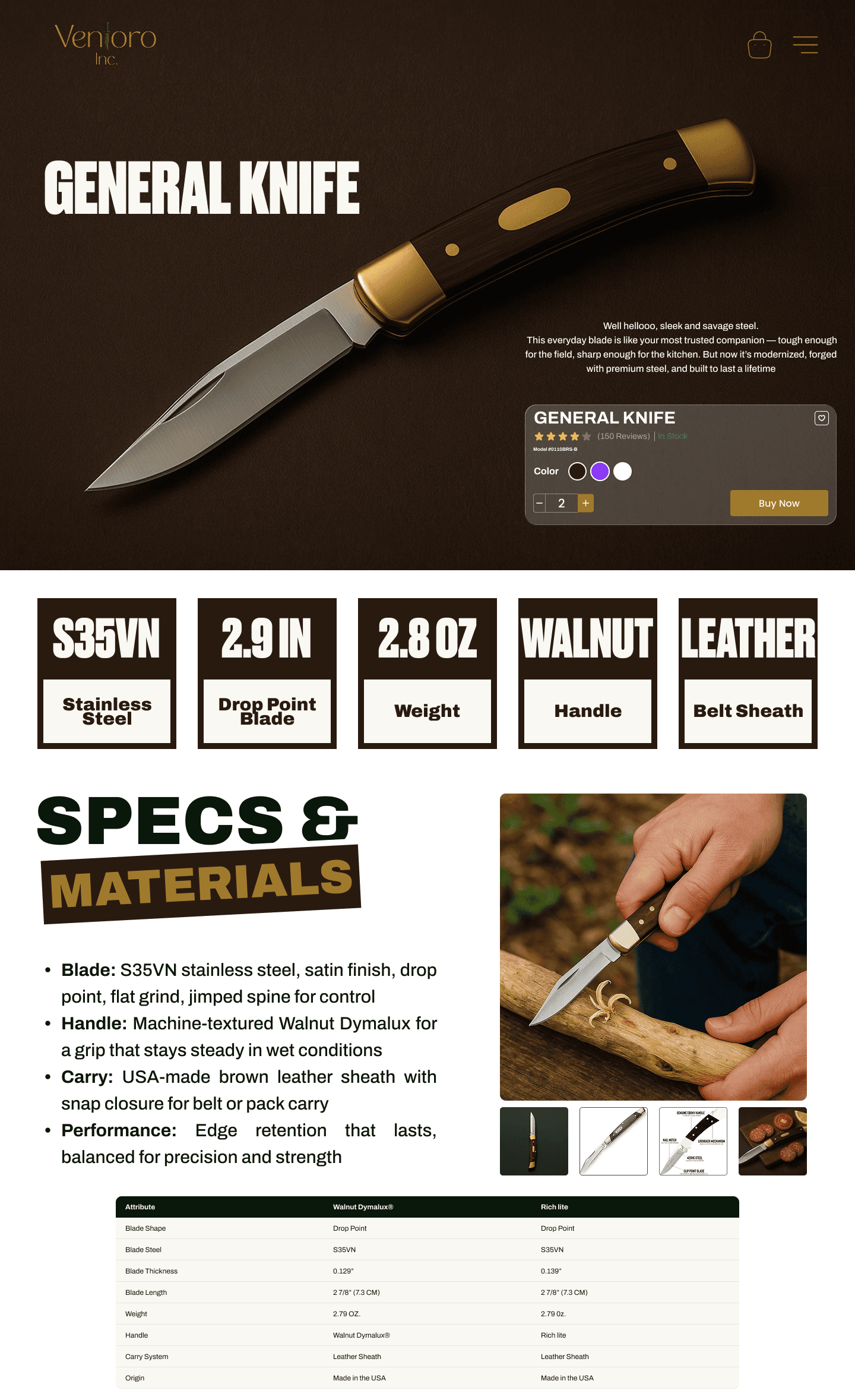
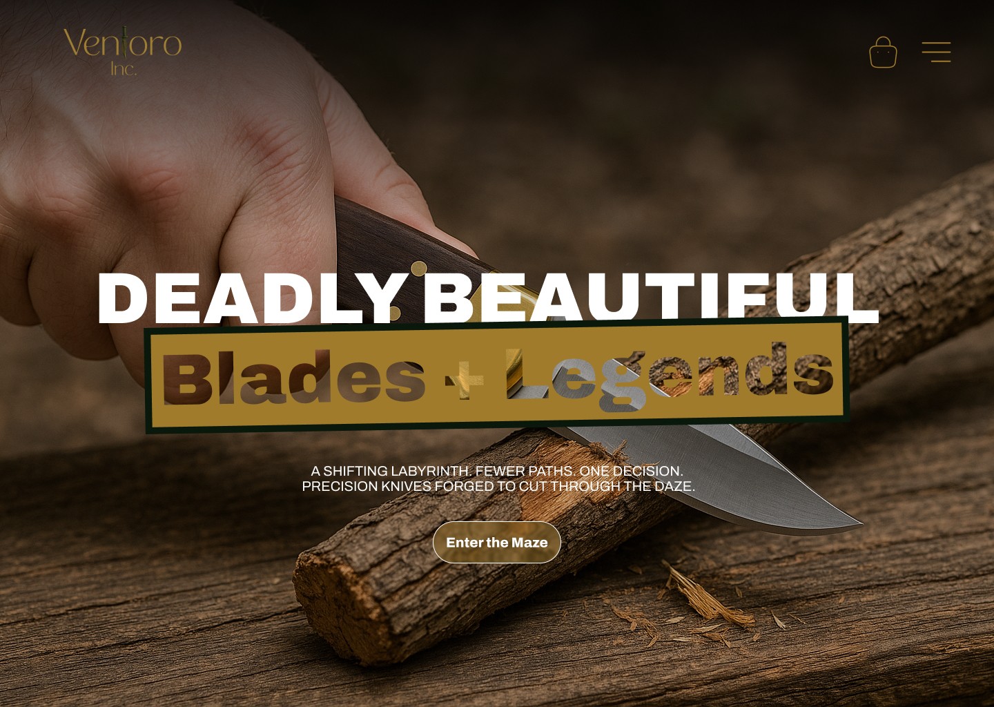
Ventoro’s existing assets didn’t convey “premium steel + craft.” Product detail was fragmented, PDPs lacked buying confidence, and mobile flows missed quick actions—leading to cart abandonment and low discovery for best-sellers.
Positioned Ventoro as a modern heritage brand. Shipped a conversion-first storefront with a story-driven homepage, rapid PDPs, and a streamlined cart. Introduced quick-buy on collection pages, sticky Add-to-Cart, and a guided comparison (chef series vs. outdoor). Implemented bundles, cross-sells, and a post-purchase upsell to lift AOV.
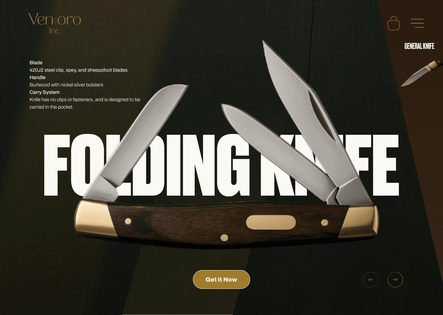
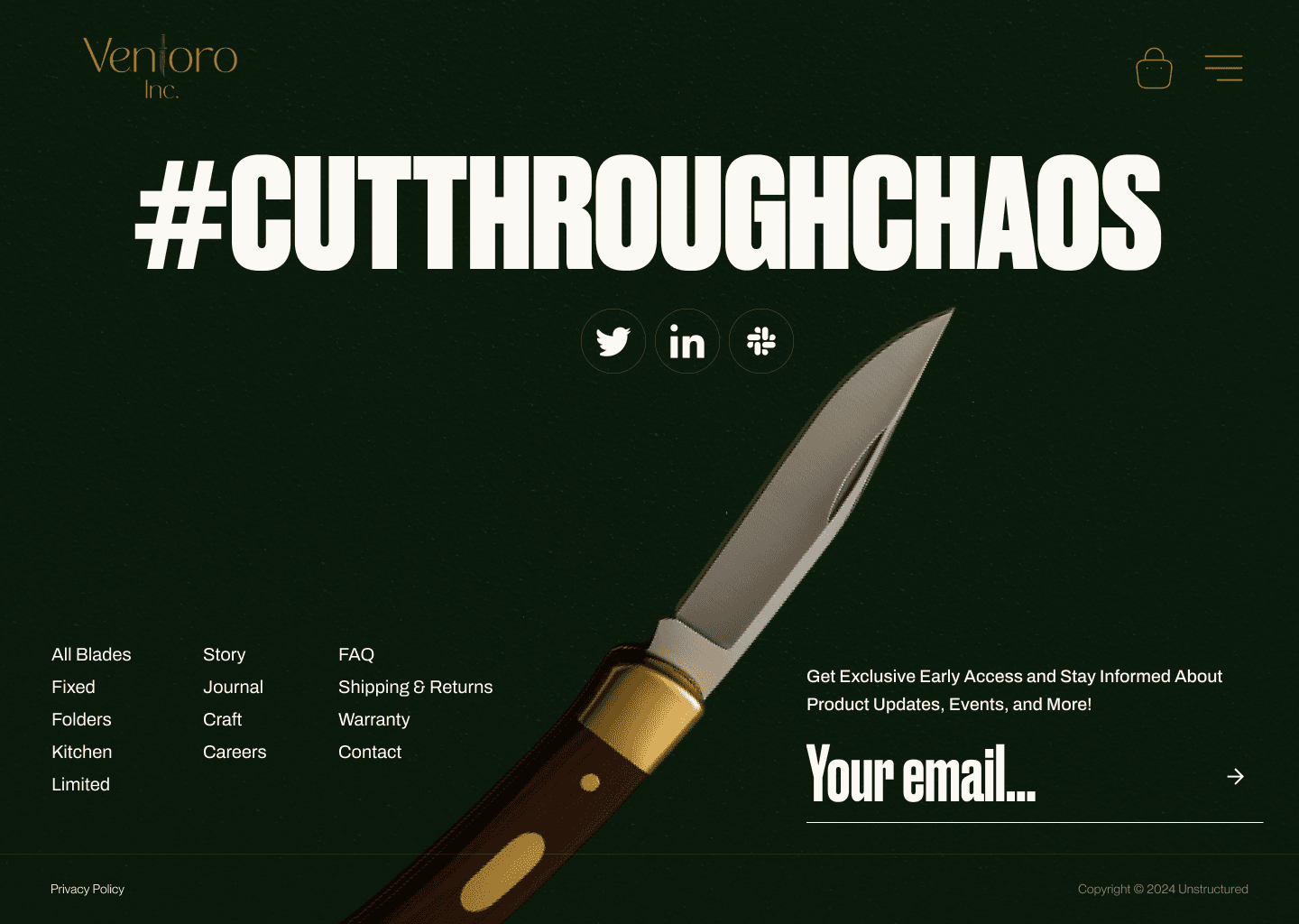
Logo: precision “V” mark with blade-inspired geometry; gold and mono variants for dark/light use.
Palette: Obsidian (#0B0B0D), Graphite (#2A2D31), Antique Gold accents (#C9A052) for luxury cues.
Type: sharp serif for headlines + neutral grotesk for UI clarity and specs.
PDP UX: steel grade, hardness (HRC), grind, handle material, balance point, warranty; macro zoom, 360° spin, care guide, and UGC reviews.
Accessibility & Speed: WCAG-aware contrast, optimized assets, and lean motion for performance.
Engineered to drive: higher Product View → ATC rate, reduced checkout drop-off, and increased AOV via bundles. Track post-launch:
PDP engagement (gallery interactions, spec tab opens)
ATC rate & checkout completion (mobile vs. desktop)
AOV (bundles/cross-sells take-rate)
LCP/CLS and overall performance score